


These days mobile apps tutorials are kinda frequent. There are few unique takes on that, but I'll focus on the one that highlights certain parts of the screen. I could go in-depth on how to do that with flutter, but instead, I have created a package that does that for you.
In this article, I'm going to go through the flutter tutorial package and showcase the most interesting features.
I have prepared an example app that doesn't have any functionality but the final effect is more eye-catching.
Highlighting a widget
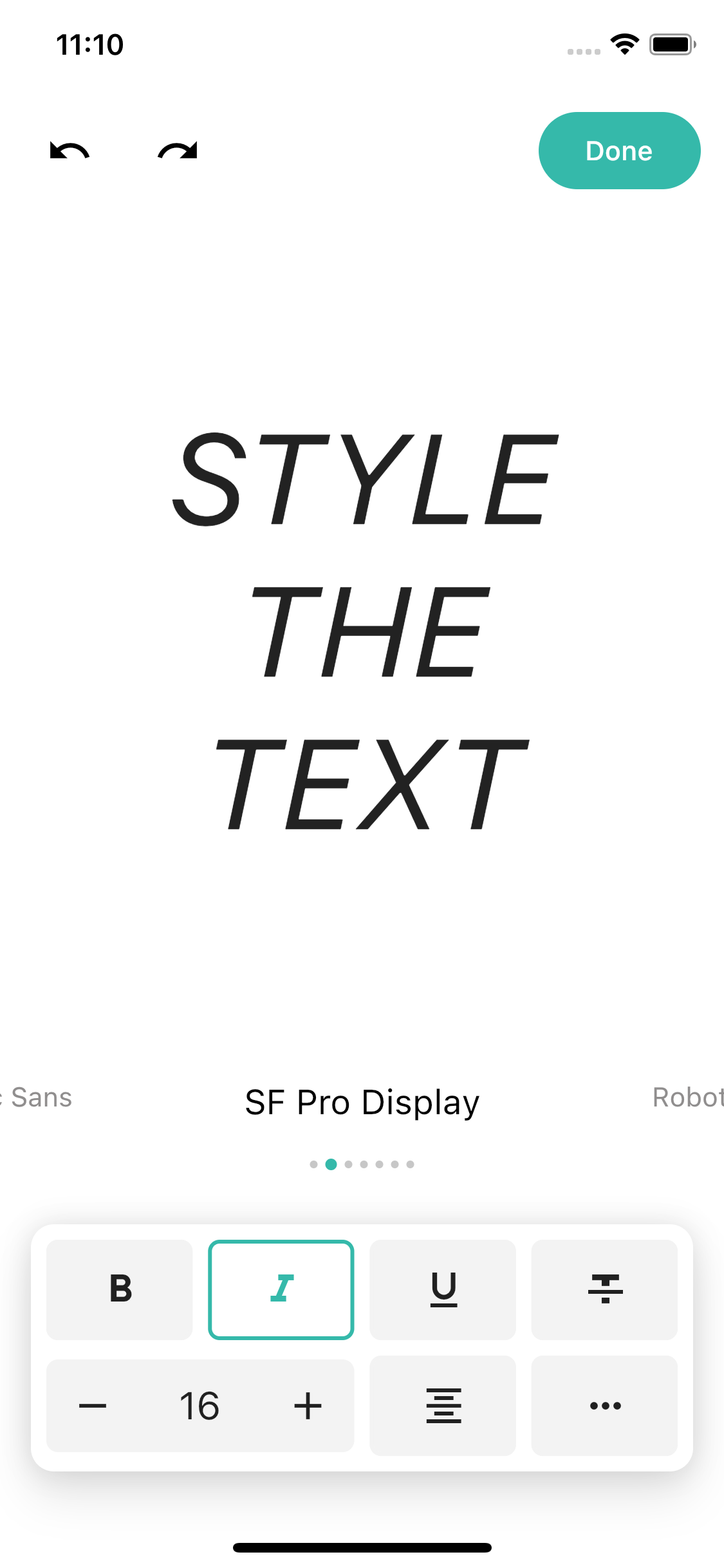
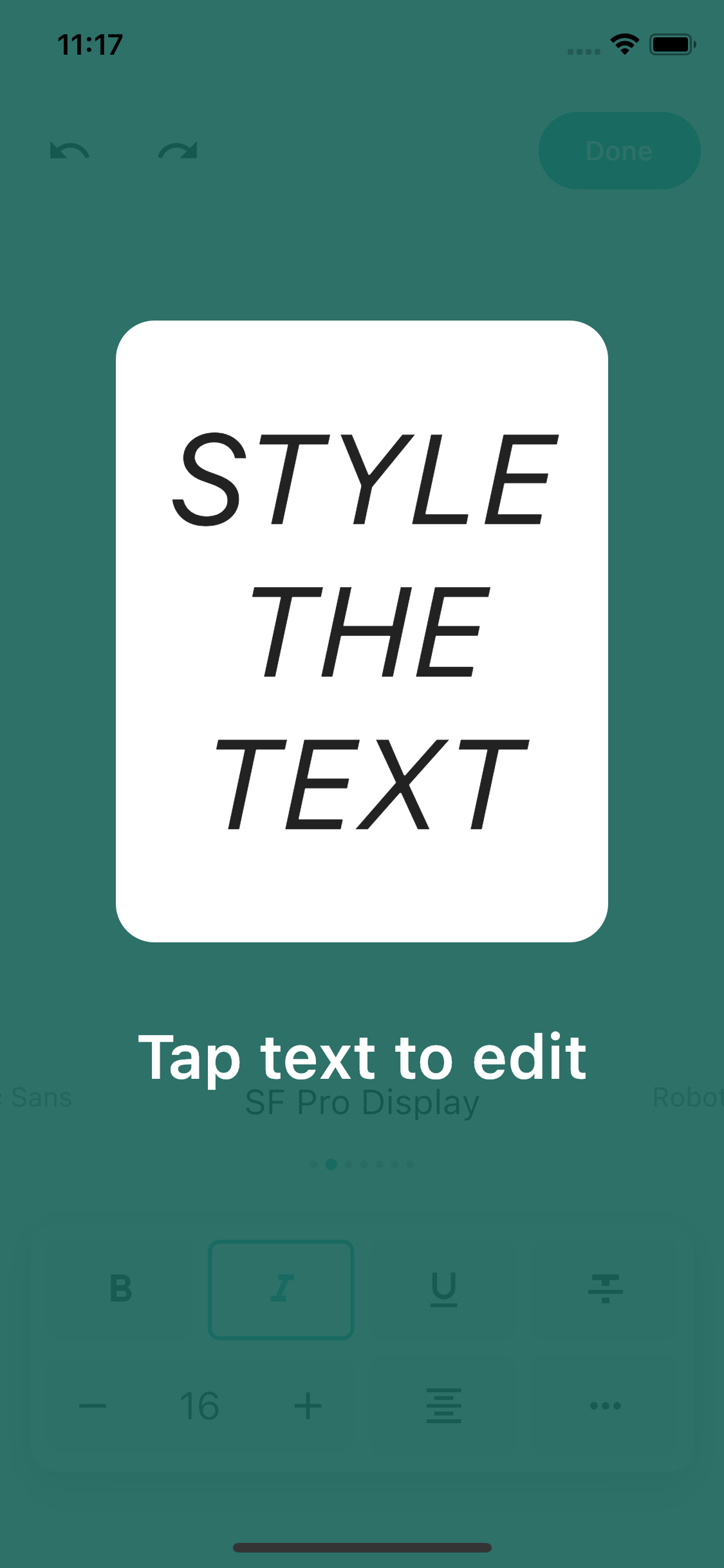
Let's first decide on what elements we'd like to highlight. Let’s start with something simple such as, for example, the widget that selects fonts.
First, we need to create a global key and assign it to the widget.
Then we just need to start the tutorial and pass TutorialEntry with a key.
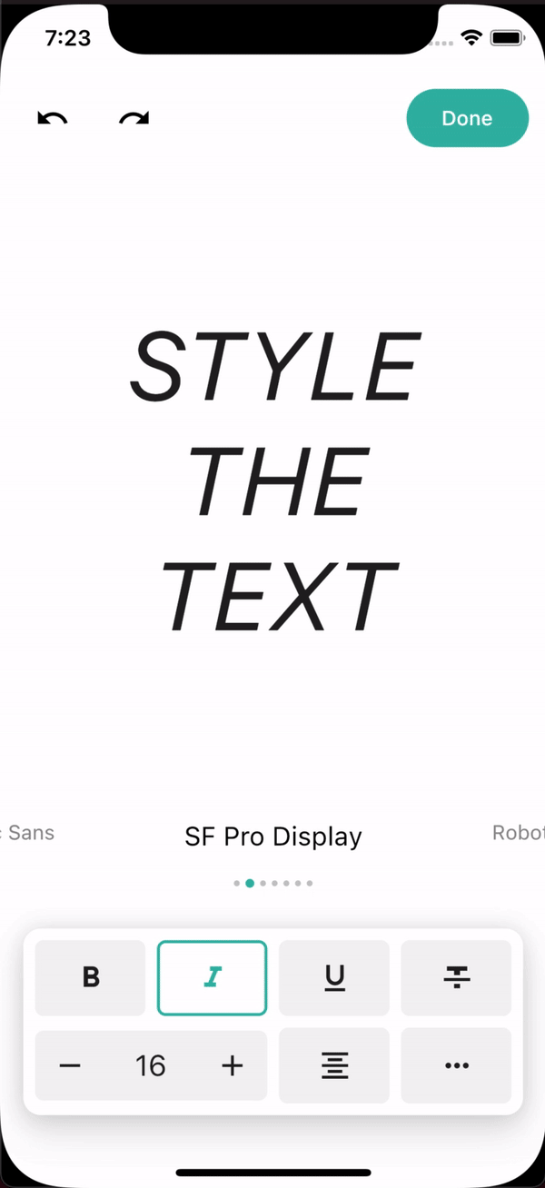
Changing background-color
You can also adjust the final opacity after animation, by default it's set to 0.5.
Adding text tips
Usually, in tutorials, we don't want to just highlight items. Tutorials are typically made to guide us through the part of the app that's not that obvious.
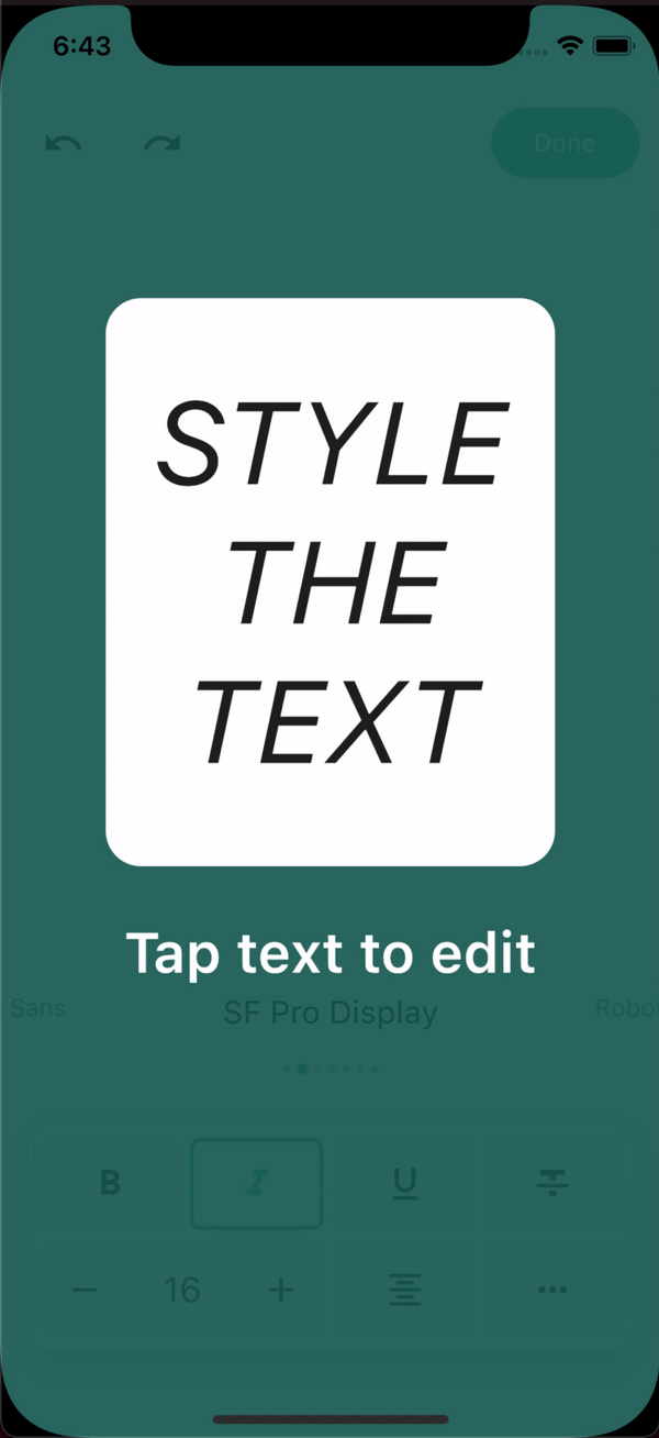
Which altogether gives such an effect:
Changing the size of the highlight
Let's add some more highlight items to our flutter tutorial and let's start with the large text in the middle of the screen. Well, if we pass the key, it'll highlight the whole area, but we probably would want something smaller that shows only the text part, but don't worry! You don't need to change your UI code. We can easily adjust the highlighted item size.
If we create a tutorial entry from RRect value, we can adjust the highlight section to whatever shape we want, we can make it smaller, bigger, round the edges, etc. The code below makes the highlight section smaller.
But if we want to make it even fancier, we can round the edges like that:
Using different texts on different pages
You could notice that I've hidden the description text in the previous example. Well, first of all, because we've set it to be in the middle of the screen and it's kind of in the middle of our highlight item. Second of all, because the description doesn't match what's highlighted. Right?
So let's get down to work and start by creating a list that'll contain objects with text and alignment.
Then we can adjust the builder to a currently selected item.
Highlighting multiple items
There isn't much to highlight multiple items, you just need to create multiple keys.
Don't worry about the animations, they'll run smoothly between entries.
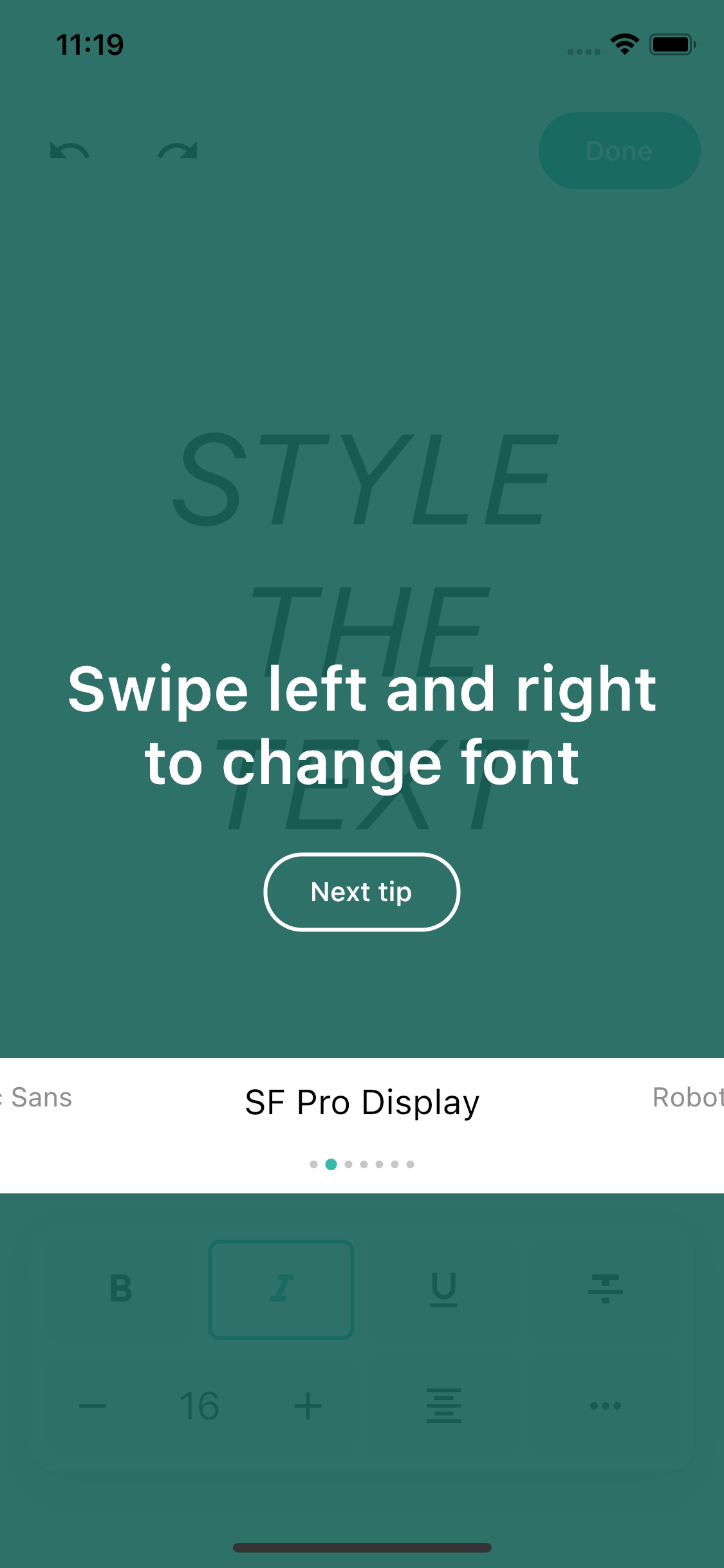
Using buttons to navigate
Well, sometimes we'd like to have a physical button like "Next tip" to navigate us to the next entry instead of just tapping at the screen. First, let's change onPressedBehavior and add a button to the dialog builder. Then we can simply use the next method from function arguments.
The same can be done with the previous callback to navigate back.
Adding animations within the dialog
I think you'll agree with me that since there are no animations within the dialog, this seems kinda stiff. So let's add some simple transition animations, but first, let's move all that dialog logic to a separate class as it's getting big and rather hard to read. Let's first create animation controllers and wrap the widget that we want to animate in them.
Let's now run the animations, once in initState and then when the button is pressed.
And that's it, let's see what it looks like!
Starting tutorial in initState
If we want to start the tutorial right away after we load the screen, there's a little catch. Because the widget hasn't finished building yet, we cannot get the reference to the objects from keys. So instead of calling it right away, just schedule it inside SchedulerBinding or add postFrameCallback.
Thanks for reading
If you have any questions or feature requests regarding the package, please feel free to file an issue at the package's repository. Full source code for this example can be found here.


